Parallel coordinates: a simpler way to large database analysis.
A simpler way to large database analysis
Large database analysis is a frequent task in process engineering. Common instruments are time consuming and their results are often hard to understand for untrained people. For these reasons, a dedicated software has been developed using parallel coordinates in order to organize and analyze data and results in a user-friendly interface.
Parallel coordinates give the opportunity of using several instruments for data visual filtering, scaling, cutting, and so on. Furthermore, they can help in performing statistics on data, providing a complete set of tools for process engineers.
The analysis of large databases
The analysis of large databases is a common practice in process control engineering. Possible fields of application are for example the evaluation of the economic benefits deriving from plant optimization, and the assessment of the actual plant performance. Indeed, databases needed for these tasks can be composed by lots of tags (it is possible to have hundreds of tags) collected regularly for a large time span, such as several months.
It is usual to perform this kind of analysis using spreadsheets, but the limitation of this approach is that, when the number of data increases, it becomes harder to have a clear sight on the process and on the results of analysis itself. Furthermore, it requires lot of time to perform that analysis, which usually results confusing.
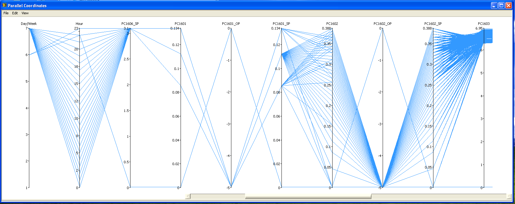
The parallel coordinates
Asper Srl has supported ALPHA Process Control Srl to create a completely new and tailored platform for large database analysis based on parallel coordinates.
Following the approach of the parallel coordinates, that is a set of Cartesian axes disposed on the same plot and each other in parallel, it has been sketched a graphical user interface where a single axis refers to a single tag and it is possible to choose which one of the tags present in the database has to be shown. The number of axes can spread from a small set, required for example in a deep analysis on a particular plant section, to the whole database set. For every sample time, a line is drawn which connects the value that all the selected tags assumed at that particular moment, giving us in this way some sort of “picture” of the plant behavior at that time. Having these lines plotted for every sample time gives the plot that results in figure 1.
First of all, it is important to show that this kind of analysis is much more “user-friendly” than having a datasheet filled with numbers, as it results more legible and gives a clear graphical information to people using it. Moreover, it allows the user to set “filters”, that is selecting only a part of the whole data set simply reducing the selection window on any single tag selected, as reported in figure 2.
In the graphical user interface, the creation and handling of filters is driven by the mouse in intuitive way and it can be fine tuned by numerical editing. This approach creates a flexible instrument for a full analysis.
Lines belonging to the selection highlight themselves, and it is also possible to remove from the plot the other lines, in order to have a clean graph. In case the data sampling time is small for the objective of the analysis itself, it is possible to reduce the number of data that are plotted simply considering various mean windows, such as hourly mean, daily mean and monthly mean. For example, considering hourly mean reduces the number of data to be used for analysis by 60 times in the really common case that data are collected every minute, and it can be done with a simple mouse click.
The filtering can be inclusive or exclusive, and different filters for different tags can be selected at the same time to obtain a composition that follows the Boolean arithmetic. It is important to stress that, selecting the expected limits for the plant to work in optimal conditions for all the tags, this analysis returns instantly the set of sampling time in which the plant performs well, and it is possible to understand quickly where deviations from the optimal behavior are present.
Acting on this selection for example, and introducing additional filters, this particular graphic method allows also to evaluate changes in profits deriving from varying plant conditions, such as low/high throughput case and so on. This can be done simply changing the filters. In the software platform, the history of the filters can be saved, navigated and compared to sets of previous elaborated filters. This approach is managed in a flexible way by dedicated browsers without loosing the work that has been done.
Summarizing the benefits in database analysis deriving from new developed software platform based on parallel coordinates, it is important to notice that this instrument gives the possibility of a clear and easy look on results, and that performing an analysis of this type is much faster than performing a traditional spreadsheet analysis, giving the same or even a better result in a fraction of the time typically needed.